Pssst... want an easy way to stay ahead of weekly consumer trends?
Subscribe to our newsletter
Pssst... want an easy way to stay ahead of weekly consumer trends?
Subscribe to our newsletter


We humans have been described as “storytelling animals” (you are human, aren’t you? OK, just checking). According to anthropologists, every culture in history has made use of stories in some form, showing it’s a deep part of our nature to absorb and enjoy information in narrative form.
Building stories around data takes all this to the next level, bringing together two very different worlds to create data-driven stories.
Successfully embed your message in a narrative built around hard data, and you instantly improve your chances of winning the attention of busy audiences – which is typically the first step on the purchase journey.
Come with us as we explore this fascinating subject, starting with a quick description of what we actually mean by “data storytelling” so we’re all on the same page.
What exactly is data storytelling?
Data storytelling is the practice of using data and analytics to build a powerful narrative tailored to a specific audience.
It’s important to say the sort of consumer data we’re talking about goes beyond simple demographics. Instead it’s deeper and more qualitative, reflecting its audience’s interests, attitudes, perceptions, and motivations.
As with much of consumer research, data storytelling is ultimately about the holy trinity of what people think, feel, and do. Get that right, and data storytelling can help take a brand out of the shadows and put it in the spotlight for consumers.
Data storytelling vs. data visualization
At first glance these two feel pretty synonymous, but there’s a difference.
Data storytelling is all about creating relatable, convincing narratives that break down complex data. Data visualization, on the other hand, uses visuals like graphs, charts, maps, and even animations to help tell a story.
So yes, both use data and analytics as their foundation, they just express that data and analysis in different ways: data storytelling is about telling a story, whereas data visualization is about showing the story.
Why is data storytelling so effective?
We’ve already seen how humans and stories go together like a wink and a smile, but there’s another reason this approach works so well.
The sheer volume of content appearing online every day is overwhelming, with over 70 million blogs published each month on WordPress alone. On top of this, consumers are using more devices and platforms than ever, meaning they’re faced with an avalanche of content, all of it competing for their attention.
How can brands cut through this content chaos in order to stand out? In a word, data.
Telling stories with data is both an effective way to capture consumer attention and highlight a brand’s creativity and audience understanding. This makes data storytelling a powerful tool to create differentiation and connection, especially for audiences craving original content that feels personally relevant to them.
Another reason to use data storytelling is that people read information, but they feel a good story. By cleverly presenting data in a way that appeals to the heart as much as the mind, data storytelling enables brands to sidestep their audience’s mental defenses against sales messages and make their point almost by stealth.
So ultimately it’s the persuading power of insights combined with the engagement of narrative that make data storytelling so powerful, giving brands who embrace this approach a real edge over those that don’t.
How to tell a story with data
If that’s the high level case for data storytelling, the obvious question is how do you actually go about it? Without further ado, here are the key steps brands should take to build a compelling data story.
1. Understand your audience
Audience understanding – in the form of targeting and segmentation – is vital in data storytelling, allowing marketers to tailor a narrative to a specific group and increase its impact in the process.
It’s common sense: by understanding the characteristics, needs, and preferences of different audience segments, data storytellers can craft messages that resonate and drive engagement.
The result supports a stronger connection between brand and audience because it feels personal and relevant. If a data story doesn’t feel relevant, then by definition it’s irrelevant – and that’s not exactly the ideal place to start.
2. Gather your data
If understanding your audience is the first step to great data storytelling, the next is actually gathering the appropriate data.
Think of individual data points as pigments on an artist’s palette – collecting more and better data enables storytellers to paint a far richer picture of consumer behavior and market trends as they craft stories that resonate and influence audience actions.
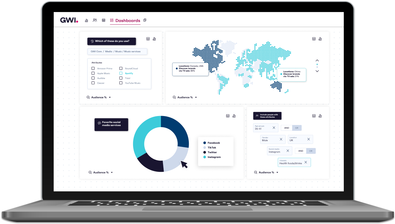
It’s here that easy access to the thoughts and opinions of literally billions of global consumers via GWI’s intuitive consumer research platform can make all the difference. Collecting the right data is essential to create a compelling data narrative that makes complex ideas engaging and digestible, and ultimately drives business success.
3. Turn your data into insights
Data analysis is a key ingredient in the data storytelling recipe. It’s the process of sifting through masses of information to identify patterns and trends that could otherwise go unnoticed. The result of this process are insights – raw data that’s presented in a way that gives it context and meaning.
Without this analytical deep dive, a data story could be just a collection of facts that don’t add up to anything in particular. Analysis transforms isolated facts into a coherent narrative that highlights what’s important, revealing the story behind the numbers and enabling audiences to make informed decisions.
4. Visualize your data story
Imaginative data visualization and representation make a data story digestible, highlighting patterns, trends, and insights that might not be obvious in, say, a table of figures.
By transforming numbers into visuals, data stories immediately become accessible, engaging, and memorable.
Visualization brings data to life and gives it a voice so it speaks directly to its audience. Whether using graphs, charts, or infographics, visualization is crucial for crafting stories that resonate in a way that raw data simply can’t.
5. Build your whole story around data
If you’re going to use data storytelling, really use it. Embrace it, commit to it. Make data integral to your story, and you’ll be rewarded. Tacking a few insights onto an existing narrative and hoping the result will work is unlikely to succeed.
As we’ve said, data storytelling is about turning abstract numbers into relatable stories, making complex information digestible and engaging for audiences in a way that lends credibility and authority to the message. It’s a way to guide audiences through a journey of understanding, where each data point is a landmark, making the data story not just interesting but also persuasive. And the full benefit of that only comes when data is integral.
6. Keep your story simple, relatable, and interesting
The core message of your data story should be accessible, relevant, and easy to explain; that’s the best way to form a deep and genuine connection with consumers.
Data storytellers have a tiny window of opportunity to engage audiences with content, so make sure what you have to say is concise, impactful, and engaging.
How exactly? Use audience data to understand what content they’re expecting to see on what channel, and then make sure you give it to them. Get that right and you’ll…
7. Tell stories that readers will want to share
Word-of-mouth is one of the most powerful marketing tools, and in today’s social media-saturated world, a good data story can be shared millions of times each day on multiple platforms.
To make sure your story is one of them, it’s important to gather insights from other brands your audience follows to get a better understanding of what stories are being retold, how these can inform your brand’s message, and how you can take a fresh approach. Make it share-worthy and there’s every chance people will share it. The opposite is also true.
Inspiring examples of data storytelling
More and more brands use some form of data storytelling to drive their marketing campaigns, so let’s meet a few who do it consistently well.
Spotify – Wrapped
Spotify really understands data storytelling – in fact Wrapped is one of the truly great data storytelling examples around today, so much so its “year in summary” format has become almost ubiquitous (as we’ll see).
Wrapped uses data on users’ listening habits across the year – from favorite tracks, albums, and genres, to themes and moods during the day – to create an interactive audio and visual experience that’s easily shared on social media. This builds positive brand awareness and creates a deeper connection for consumers.
Interestingly, Spotify not only does a stellar job of connecting with consumers but also with artists. Their fan study is a quarterly exploration that uses millions of data points to help musicians develop their fanbase. The report is broken down into multiple sections – all based on Spotify user data – showing engagement and suggesting ways for bands to deepen the musician/fan relationship, right down to nuts and bolts ideas for getting their merch in front of fans.
Monzo bank – Year in Monzo
Year in Monzo is another excellent example of data storytelling that looks back on how customers spent, saved, and – as they put it – “Monzo’d their way through the year”.
It includes insights like the “top places each customer used their Monzo card” for eating out, shopping, and entertainment. Depending on how an individual customer uses their Monzo, it can also show who they spent money with, and how much they managed to save.
Monzo’s website also offers some interesting insights on how and why they chose this particular data storytelling approach, under the title of “Transforming spending habits into tales worth telling” – which captures the essence of data storytelling in a nutshell.
For example, they explain that in order to tell an engaging data story, they set the entry bar at a minimum of 15 eligible transactions (with gambling and one or two other transaction types excluded for ethical reasons). Below that number, Monzo felt the narrative might lack the depth needed to paint a vivid picture of the user’s financial data story. Above that number they hit the sweet spot where inclusivity meets captivating storytelling.
The result is an experience that’s not just delightful but also substantial, unlocking useful and highly entertaining insights about Monzo customers’ spending habits.
Google Trends – Year in Search
Another example of the “last 12 months summarized” data story that Spotify does so well, Google Trends Year in Search reveals the questions we shared, the people who inspired us, and the moments that captured our attention each year, at both a global and country level.
Categories include news, people, actors, athletes, games, musicians, recipes, songs, sports teams, and TV shows. Results are presented “over time” and “by region”, and are highly explorable.
If you need a snapshot of what the world is searching for – and therefore presumably considers important – then Year in Search is it. For example, it turns out that in 2023 bibimbap was the most searched-for recipe, NFL player Damar Hamlin was the most searched-for person, and Hogwarts Legacy was the most searched-for game. Fascinating stuff, all presented with Google’s typical precision and clarity.
Asana – Year in Review
The final “annual summary” data story we’ll present is Asana’s Year in Review. Kudos to them for not calling it Year in Search like so many others.
As well as having a slightly different name, Year in Review also takes a slightly different approach, celebrating the goals and milestones Asana customers achieved. To dig into these accomplishments and explore what made them possible, Asana looked at the nuts and bolts of how work really happened in 2023.
What they uncovered is more than just data; it’s a reflection of how Asana customers worked, collaborated, set goals, and achieved them together over the year.
For example, the start of the week – usually greeted with groans – emerged as a powerhouse of productivity in 2023. This was the time when Asana customers channeled their energy and focus to drive mission-critical work forward. Asana found that Tuesdays were when most of their customers really hit their stride, finishing the most tasks of any day of the week.
They also revealed a pattern in how productivity ebbs and flows throughout the year. Asana customers saw a significant surge in task completion from late October to mid-November, outpacing any other time on the calendar. Similarly, the late August to late September period, when people typically return from summer vacations and dive back into work with renewed vigor, showed the second-highest task completion rate.
GWI – Connecting the Dots
Admittedly we’re a little biased, but hear us out.
Our annual flagship report Connecting the Dots makes use of data storytelling techniques to break down and bring to life the biggest trends our analysts predict will blow up big in 2024. It offers an in-depth look at how people are feeling, what they’re thinking, and how life is changing across both the US and global markets, so brands can be ready for tomorrow.
In our latest report we focused on 6 key themes: changing trust in the news, tensions around AI, the rise of boomers using social media, how short form video is changing sports coverage, declining interest in veganism, and growing concerns around gun violence in the US. Bottom line? We’ve crunched the numbers on key emerging consumer trends so our customers don’t have to.
Last words
We hope you enjoyed this quick overview of data storytelling. As we’ve seen, using data-driven stories can help marketers boost engagement, improve decision-making, and enhance brand perception, turning complex topics into relatable stories that make it easier for audiences to understand and connect with the message.
Data storytelling FAQs
What three components are required in a data storytelling narrative?
The three key components of data storytelling are: data itself, which provides the factual backbone; a clear narrative, which pulls the whole thing together into a coherent data story; and appealing visuals, which bring the data story to life. Together they create an engaging and informative experience that resonates with audiences.
How does a digital marketer use data storytelling?
Digital marketers use data storytelling to craft compelling campaigns that appeal to their audience. By analyzing data to uncover trends and insights, they create narratives that personalize the customer experience, enhance engagement, and drive action, effectively turning raw data into a powerful tool for connection and conversion.